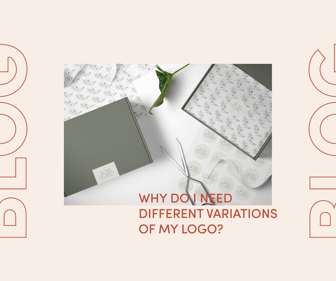
Why do I need different variations of my logo?
I thought today I would explain why it is handy to have different versions of your logos in your visual branding and what they are useful for. Having several variations of your logo gives your business flexibility to show up consistently across all platforms making you easily recognisable. Below I run through the different variations and where you can use them...
Primary logo
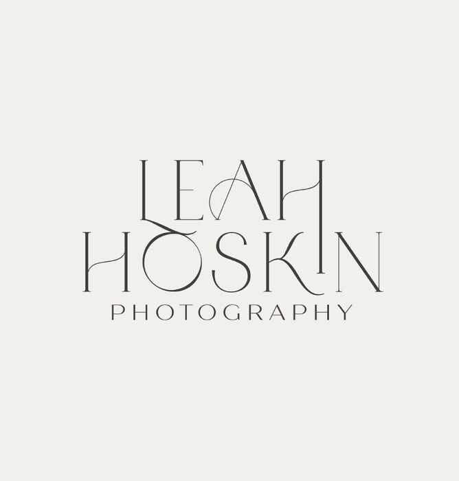
This is your main business logo which you'll use across most of your print and digital touch points. It's typically landscape and will likely include your tagline, established dates and any imagery.
Use for website, advertising, signage etc.
Secondary logo
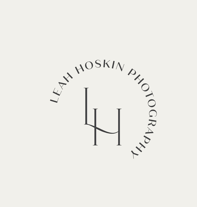
Have you ever noticed that your landscape formatted logo doesn't quite fit in the small circle area so well? This is where the secondary logo slots in! Normally sized to be in opposite proportions to the primary logo. This one is a stripped down version without the tagline and extra details and capable of fitting into smaller areas.
Use for business cards, invoices, letterheads, social media etc.
Brand mark ( logo mark or sub mark )
This is a really simplified version of the primary logo. Designed to be simple but still recognisable as your brand. They can either include the whole business name or just the initials. They are exceptionally handy for small spaces where the other variations become too hard to read.
Use for social media, website favicon and footer etc.
Icon
A really simple small design which typically consists of a small illustration or the initials. The icon is useful for the tiniest of spaces and for adding creativity to your print and digital spaces. Not necessary as important as the three above, but quite fun to have.
Most commonly use as a favicon, watermark and for creative fun.
Hope that was helpful to understanding why its handy having a few variations of your logo on hand.
Take care, Kelly
P.S. If you have any design projects you are looking to start and you need a hand with. Yell out, I'm happy to help.


