3 Quick tips for creating & using your brand colours amazingly.
Colour is a powerful tool in branding that can significantly impact how your business is perceived. When used effectively, it can make your brand more memorable and evoke specific emotions in your audience. I'm excited to share some key tips on this topic with you
✖︎ Tip 1. Brand Focused
Before choosing a colour palette for your brand, consider things like:
• It ties in with your brand identity
• Understanding what emotions colours can evoke
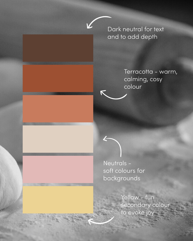
• A balanced colour palette of primary, secondary & neutrals
• Gather inspiration from around you, images, Pinterest, Adobe Color,
and much more
✖︎ Tip 2. Consistency
Use your chosen colour palette consistently so you become recognisable.
Use across your:
• Website
• Social media templates
• Marketing material
• Lookbooks, documents
• Signs, business cards, thank you cards
✖︎ Tip 3. Contrast
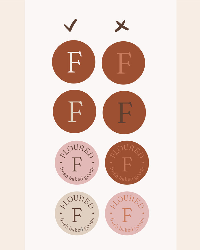
Using contrast helps make it easy to read your text on your socials, website, print etc. It also makes it more interesting.
As you know I absolutely adore colour, and could talk your ears off about it forever. But this is a snippet to help
Kx


