Easy design tips to improve your social media graphics and elevate your brand presence
Hi friends, how are you! I hear often that one of the biggest struggles small business owners have, is not only what it post on social media but how to put them together. So I've put together some quick design tips for my DIYers and those wanting to get their social media posts looking sharper.
Tip 1. Margins or white space
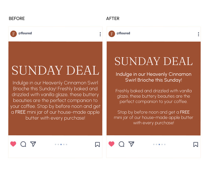
Add a little wiggle room around the border of your images and text. This is called your margins. But it will allow everything to breathe a little. I also added some space between paragraphs. See the difference in the left ( before ) and after ( right )?
Tip 2. Limited fonts
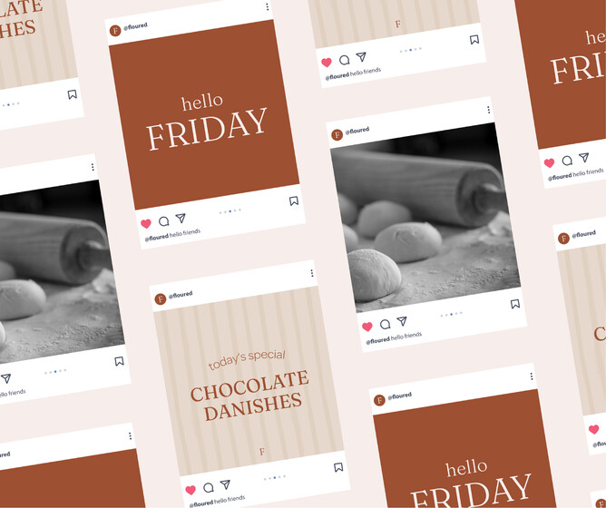
Choose 1-3 fonts at the very most to use. If you've worked with a designer, use what they have suggested. Only use these, and use them consistently across all your posts.
See how the posts look really good together, as they use the same colours and fonts together.
Tip 3. Colour
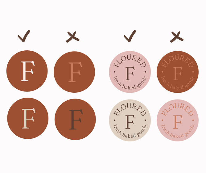
Using contrast with your colour helps make it easy to read your text on your social media graphics. It also makes it more interesting.
See the difference when I use contrast in the examples below.
Keep an eye out, as I add more over the coming weeks!
Kelly


