What do colours mean in branding and their importance
As part of any design project, there is always a discussion about colour, in particular what colours the business wants to use to represent itself.
Now believe it not, this can be a huge conversation, as colour can mean a lot of things, because how it evokes so much meaning. And as Marketing101.com says
“Around 85% of consumers believe colours are the biggest motivator while opting for a product. In addition, around 92% of consumers consider visual identity as the most persuasive marketing factor overall”
It’s really important you get it right as it can make a big difference to your sales. Today we are going to look at 9 main colours and what they represent…
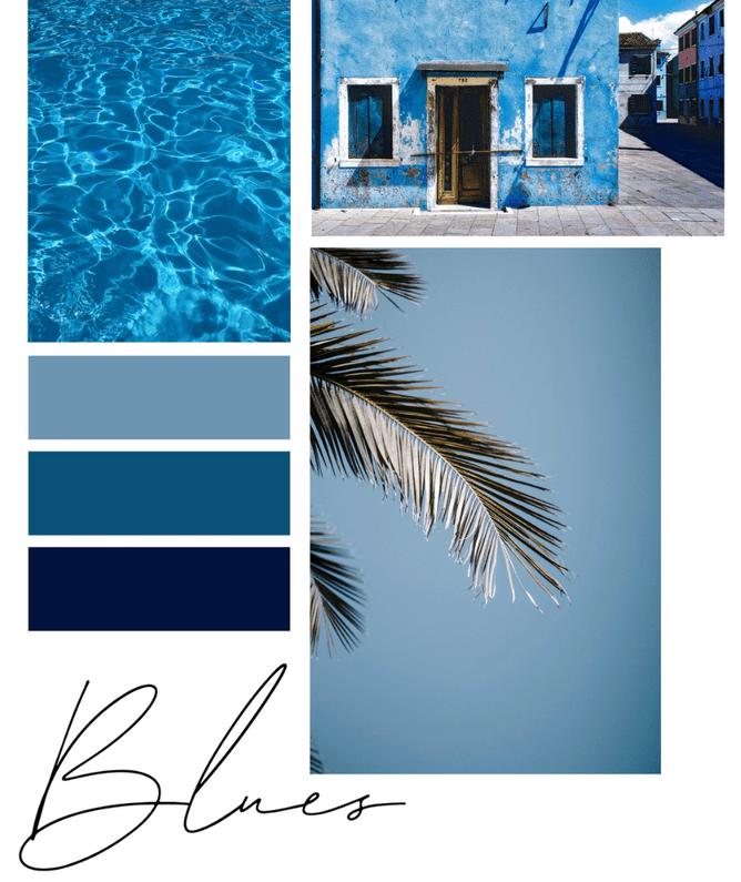
BLUE
The colour blue is a trusted and fairly likeable colour. It is probably one of the safer choices for a brand, as it's known as the colour for being traditional, loyal, and business focused.
You’ll see a lot of finance and authoritative businesses using blue.
Examples include:
Paypal
BNZ
ANZ
IBM
Ford
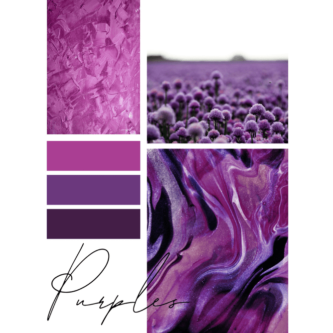
PURPLE
Purple is seen as the colour of royalty, therefore it can reflect power, luxury, wisdom and creativity.
Often used for high end products or women/children products. Though the rule can be broken if you want to stand out like Taco Bell and FedEx did.
Examples of brands using purple include:
Cadbury
Hallmark
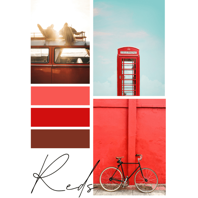
RED
Any guesses, why would you want to use red in your branding? That’s right, you want to attract attention, or create hunger if you are a restaurant brand.
Red is bold, and exudes energy and like I said it can increase appetite.
This vibrant colour is used by the likes of:
KFC
Burger King
Lego
Coca Cola
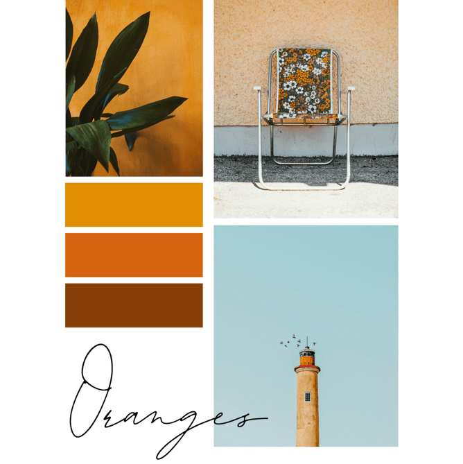
ORANGE
This is a bright colour that expresses fun, boldness, and not wanting to follow the norm.
It's often used for brands really wanting to stand out from the competitors and express its adventurous and friendly attitude.
Brands using orange include:
Amazon
Temu
Etsy
Fanta
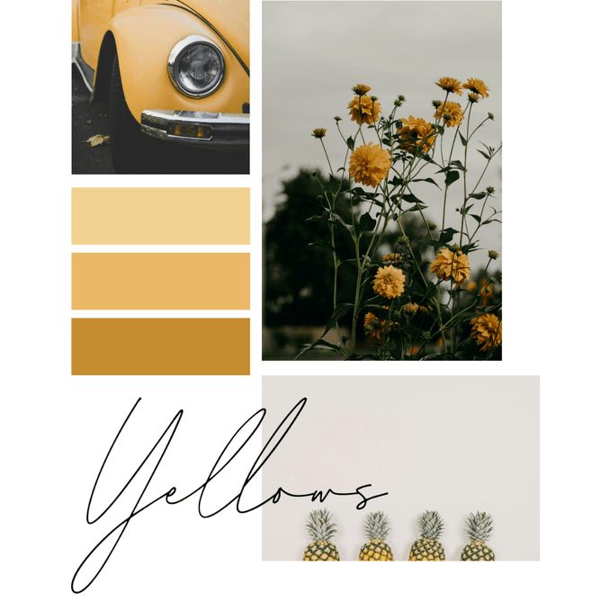
YELLOW
Yellow is a bright cheery colour used for brands wanting to evoke this feeling, and quite commonly (and understandably) safety.
This joyful colour can be seen being used by:
Mailchimp
Nesquick
JB HIFI
The Yellow Pages
CAT
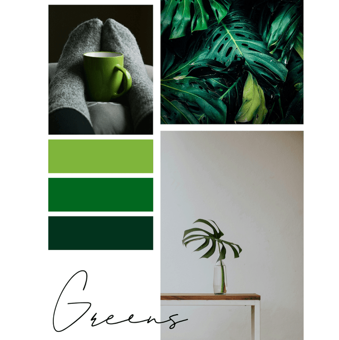
GREEN
The colour green represents growth, calmness, balance and youthfulness. You can understand why many finance, eco friendly and wellness brands choose to use green.
Brands include:
Starbucks
Kiwibank
Garnier
LandRover
Shopify
Heineken
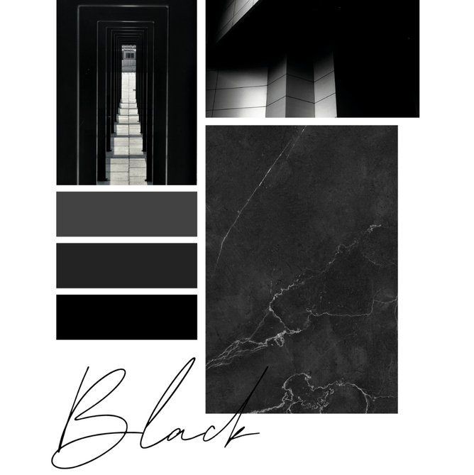
BLACK
Black can be used to create a modern look in a brand identity, but it can also evoke high end quality and authority.
It can be seen in many of our popular brands such as:
Nespresso
Moet
MAC
L’Oreal
Nike
Adidas
Chanel
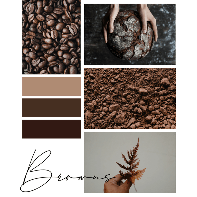
BROWN
This earthy colour can make brands feel warmer, calmer and comforting. It’s no surprises these brands using this colour:
MM’s
Hersheys
Magnum
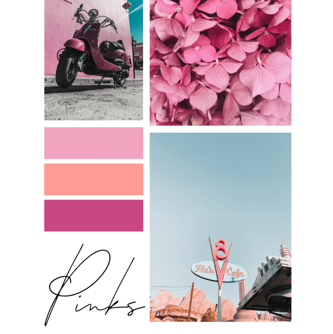
PINK
Pink is the colour of femininity, gentleness and playfulness. This warm welcoming colour is often used in children, fashion, beauty products and charitable trusts.
Examples of brands using pink include:
The New Zealand Breast Cancer
Barbie
Dunkin’ Donuts
Hello Kitty
I do want you to keep in mind that you can break the rules! Because, when choosing your brand colours it's actually down to your story, values, target market, what you like etc too…
Here are some examples of brands I’ve created and how they’ve used colour….
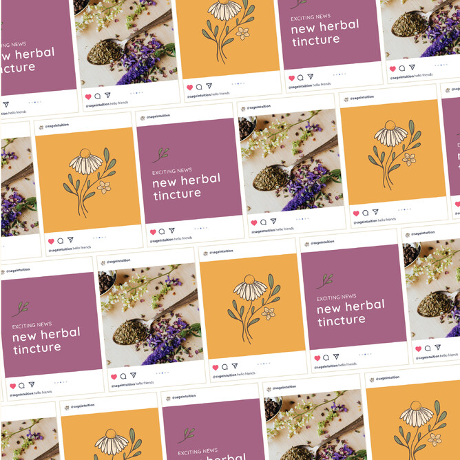
SAGE INTUITION
Naturopath Natasha takes a beautiful holistic and knowledgeable approach to women's health and her whole business model is very warm and joyful. This is why her colour palette of autumn yellow, soft oranges, and purples are fitting.
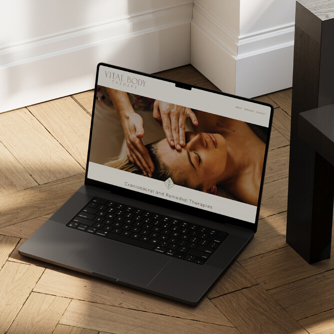
VITAL BODY THERAPY
Craniosacral and remedial therapist Heather works with babies and women of all ages, helping them to manage pain and mobility. Her approach is friendly, warm and calm. It comes with an amazing 30 years of experience. Her branding inspo came from the veins of leaves and how they looked like the connections in our bodies. So her colour palette is more nature inspired with greens and browns.
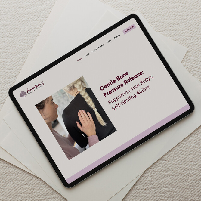
ANNAH VERHEIJ
Annah, a really lovely contact care practitioner, takes a really gentle approach to her treatment. She takes a lot of care in listening to you and explaining the method so you understand what's going on. Annah is a gorgeously fun soul, so her colour palette is little more brighter with purples paired with soft neutrals
**Colour images via pexels.com
